Written by Teodor Iliev
1,230 followers
Updated
Dec 27, 2023

Finding the best lead generation landing page template for converting visitors into clients can feel like navigating through a labyrinth of options.
You want a landing page that:
Grabs attention and ignites curiosity: Forget generic layouts. Make your agency stand out with unique templates designed to speak to your specific services and target audience.
Drives conversions seamlessly: No more clunky forms or confusing CTAs. Our high-converting templates guide visitors through the lead capture process effortlessly.
Showcases your expertise: Ditch the cookie-cutter approach. Brand your landing page with your agency's personality and values, building trust and connection with potential clients.
This guide is for you if:
Your current landing page isn't generating enough leads.
You're tired of wasting time on templates that don't convert.
You want a landing page that reflects your agency's unique brand and drives results.
As the founder of Wize Design and Wize Templates, I've been in this game for over seven years. I've worked on website designs for major names like Sony, G2 eSports, HP, and NYU.
I’ve done the legwork for you. Based on years of experience and extensive testing, I’ve curated a collection of lead-generating landing page templates that:
Stand out from the competition with eye-catching designs that keep visitors engaged.
Convert more leads with intuitive layouts and frictionless lead capture forms.
Don't settle for a landing page that's just "good." Let's create one that's truly unforgettable and turns website visitors into your agency's next big clients.
Lead Generation Landing Page Templates: Setting The Stage
In this day and age there are numerous ways to build a new website - you can code it and host it yourself, you can use Wordpress, or maybe newer platforms like Webflow or Framer.
The common thing between all of these, is the fact that templates exist for all of them.
Some are harder to work with, while others are designed to be easier.
One of the most beginner-friendly website builders you can start with is Framer. And in this article we are going to explore lead generation templates built for Framer.
Most of the templates we’ll look at are designed for digital agency businesses, but the principles can be adapted to most other online businesses.
We’re going to use the following criteria for each template:
Aesthetics & appearance
Conversion funnel strength
Ease of customization
So, with that out of the way, let’s now dive into the lead generation landing page templates.
I Tested 3 Lead Generation Landing Pages: Here’s What I Found
There is a wide selection of different templates on the Framer template marketplace so in this article we will be focusing only on templates with clear conversion funnels.
That means they have to have a clear conversion point that the site visitors can use to get in touch with the business.
All of the following templates are also designed to be easily customizable, and come with a free step-by-step video course showing you how to edit your new template.
Landing Page #1 - Nile

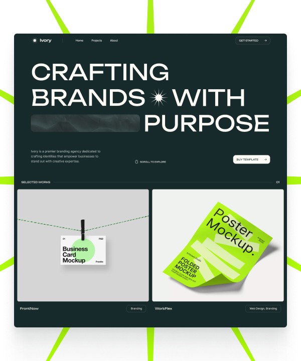
Nile is a single-page template designed to have all the essentials of a well-performing conversion-focused website, and nothing more.
Its conversion funnel is focused on strategically telling the story of your agency.
It takes the user on a journey where he learns about the services you offer, he sees clear examples of your work with the case study section, he sees what your clients think about you with the testimonials, and he can easily convert straight on the page with the Calendly embed.
I Found 3 Key Benefits
Dark mode design that gives it a modern and fun look and feel
Super easy to customize
Has all of the essentials for a well performing conversion funnel
Price: $35
Landing Page #2 - Agenxy

In contrast with Nile, Agenxy is a comprehensive website template with 8 unique pages that allow you to build out a full lead generation website.
However, the template still has a conversion funnel that follows the best practises.
In fact, it offers 3 different home page funnels suitable for different types of businesses.
It offers a conversion point on the Contact page where users can fill out a form to get in touch with you.
It’s design style is quite unique. In terms of colors it’s similar to Nile, but it has a brutalist approach to its design, using unique shadows and lines to make your website stand out.
It is slightly harder than Nile to customize but that’s purely because it has more pages, making it more time consuming to go from 0 to launching your website.
I Found 3 Key Benefits
Unique brutalist design approach
8 unique pages and more than 27 unique sections, giving you tons of flexibility to tell your story
3 different home page conversion funnels suitable for different types of businesses
Price: $79
Landing Page #3 - Mont

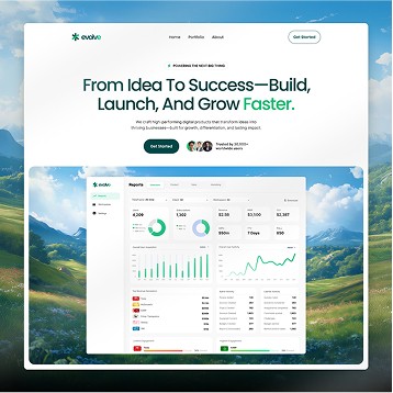
Mont is a nice mix between the previous two lead generation templates - it has 4 unique pages - Home, About, Blog, and 404.
Design-wise, it’s a lot different than the previous two.
The design here is a lot lighter, using white and blue as the two main shades.
That makes it a lot cleaner and more minimalistic than Agenxy and Nile.
Its home page is again using industry best practices when it comes to the conversion funnel.
The strategically placed CTAs are meant to lead your users to an external URL, preferably to a software that allows them to book a call with you, like Calendly or Cal.Com
This template features a CMS blog that gives you the opportunity to publish SEO optimized articles, and therefore get traffic from search engines.
I Found 3 Key Benefits
Clean, light-mode design
Clear conversion funnel following industry best practices
CMS Blog that allows you to capture traffic from search engines
Here’s What All High-Converting Landing Pages Have In Common
All lead generation landing pages that tend to have a higher conversion rate show the user what they want to see.
When building your new website, always ask yourself - is what I’m sharing going to answer a question a potential client of mine might have.
Those major things you should share, usually are:
Describe your core offer, and who it is for
Describe your services
Share the key benefits your client expects to get by working with you
Share examples of your previous work in the form of case studies
Share real testimonials from your previous clients
Offer a clear conversion point on your website - either a contact form or a calendar that allows your visitors to book a call with you
If you check each one of those boxes, then your page should have all of the necessary info a potential client of yours might want to see before they get in touch with you.
With these sections we build trust in our business, showing our site visitors that we are capable of delivering what they need with clear examples of our work, with testimonials from other people just like them, and by clearly describing our services we demonstrate our expertise.
Finding A Lead Generation Landing Page Template with Wize Templates
All of the templates we build here at Wize Templates are designed with the industry’s best practices.
We use proven conversion funnels we have developed over the past few years while working with big and small digital agencies around the globe.
We have general landing page templates, as well as niche-focused landing pages, like our FORYOU template, built for Short-Form Content agencies, or like the Rio template - made for AI automation agencies.
You can explore our full catalog here.
Written by Teodor Iliev
1,230 followers
Teodor Iliev is the founder of Wize Design and Wize Templates. He has more than 7 years of web design experience in agencies that have done work for Sony, G2 eSports, HP, NYU, and more.


